This article has been translated to Chinese by 小八 on W3cplus.
So I just listened to Jen Simmons’ interview on the Boagworld podcast about CSS shapes and although I’ve heard about CSS shapes for a while now, I never really tried it out for myself. But for some reason, this interview just compelled me to sit myself down and really understand what the excitement is all about. (Ok, it could largely be because I think Jen Simmons is awesome and I’ve been listening to her fantastic podcast, The Web Ahead for more than a year now)
The first thing I did was to read the W3C spec for the CSS shapes module level 1. Yes, the spec does read a bit like some legal document in the beginning, but the fun starts from section 2 where all the cool stuff is. In a nutshell, CSS shapes allows us to wrap text around more than just rectangular boxes. You can now wrap your text around circles, ellipses and polygons and even images.
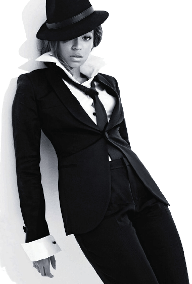
Before CSS shapes came along, we were more or less locked into standard layouts of rectangular columns. We had to explain to designers who came from print design that no, we can’t make the text flow around your beautifully cropped image of Beyoncé.


CSS shapes is being developed by the Adobe Web Platform team and they have blogged about how this spec has been developing since 2012. Check out the cool demo the team built, based on Alice in Wonderland, to showcase CSS shapes’ capabilities. Point is, with CSS shapes, it’s totally possible to have text wrap around Beyoncé’s elbow.
To be honest, the W3C spec is not that easy to understand, so here’s my attempt at explaining it in plain English. A prerequisite for applying a CSS shape property to an element is that the element must be floated. It doesn’t work on non-floated elements.
If the browser you’re using right now supports CSS shapes, you should see text wrapping nicely around the image of Beyoncé, otherwise you’ll just see the standard rectangular column of text. (Hint: Try using Chrome or Safari)
There are 4 basic shape functions you can use to define an element’s shape, in other words, how you want the text to flow around your element. In addition to that, you can also extract a shape from images with an alpha channel.
The browser identifies the required shape from the shape-image-threshold property. Pixels which have a higher alpha value than the threshold will make up the shape, so it’s value must be between 0.0 (transparent) to 1.0 (opaque). If, for some reason, your image doesn’t load, there will be no shape to speak of.
For now, text can only flow on the opposite side of the float declared on the element, meaning if it’s floated left, then the text will flow on the right, and vice versa. In the future, it will be possible to make text flow all around an element with something called CSS exclusions.
Here's an example of how you would use `shape-outside` to make text flow along an image.
.shape {
  shape-outside: url("path/to/nicely-cropped-image.png");
  shape-image-threshold: 0.5;
  shape-margin: 10px;
  float: left;
}
There are two types of shape properties:
shape-outsidewhich flows the text around a shape. This goes with theshape-marginproperty.shape-insidewhich wraps text inside a shape. This goes with theshape-paddingproperty. (This property has been deferred to CSS shapes module level 2)
The circle() function

.circle {
  /* general styles for the div*/
  width: 200px;
  height: 200px;
  background-color: #a4f4b0;
  border-radius: 50%;

  /* make it a shape!*/
  shape-outside: circle();
  float: left;
}
The formal syntax for using the circle() function is:
circle( [<shape-radius>]? [at <position>]? )The question marks indicate that the parameters are optional.
CSS shapes live inside a reference box, which is the basis for the coordinate system. It follows the CSS box model. Razvan Caliman, one of the engineers working on CSS shapes, wrote a very good in-depth article on CSS reference boxes.
The shape-radius is the radius of the circle and takes any length unit (px, em, rem, etc.), as well as percentages. You can also use closest-side and farthest-side.
closest-side uses the length from the centre of the shape to its closest edge of the reference box. Conversely, farthest-side uses the length from the centre of the shape to its farthest edge of the reference box. This property defaults to closest-side if left blank.
The position is represented by a pair of x and y coordinates on the element’s coordinate system. It defaults to (0, 0), at the centre of the element.
CSS shapes is one of those properties that won’t totally break your layout if someone is viewing it on an unsupported browser. It just falls back onto the usual rectangular column most people are already used to anyway.

The ellipse() function
.ellipse {
  width: 100px;
  height: 200px;
  background-color: #a4f4b0;
  border-radius: 50%;

  shape-outside: ellipse();
  float: left;
}
An ellipse is just a circle that appears to have been sat on. Or squashed. So the official syntax for the ellipse() function is:
ellipse( [<shape-radius>{2}]? [at <position>]? )Notice the 2 behind shape-radius? This just means the function takes in 2 variables, the length of the ellipse’s radius on the x-axis and another length on the y-axis. Like the circle, it defaults to closest-side.
The position variable also behaves like the circle() function, and the coordinates default to (0, 0), the centre of the ellipse.
The inset() function
.inset {
  width: 200px;
  height: 160px;
  background-color: #a4f4b0;
  border-radius: 50px;

  shape-outside: inset(0px round 50px);
  float: left;
}
It took me a bit more time to wrap my head around the inset() function, but what helped was playing around with the code on Codepen. Here’s the official syntax for the inset() function:
inset( <shape-arg>{1,4} [round <border-radius>]? )The shape-arg takes in variables the way we write the shorthand for margin or padding, in the order of top, right, bottom then left. So you can pass in 1 value, 2 values or 4 values. Inset is applied from the edge of the element inwards toward the centre.
shape-arg is set to 0px
shape-arg is set to 15px
The optional parameter here is border-radius, which allows you to create rectangles with rounded corners and flow your text along those rounded corners. Personally, I think the border-radius property is what makes the inset() function useful at all since we can already make text flow around normal rectangles, but that’s just me.
The polygon() function
.polygon {
  width: 200px;
  height: 200px;
  clip-path: polygon(0 0, 0 200px, 200px 100px);
  background-color: #a4f4b0;

  shape-outside: polygon(0 0, 0 200px, 200px 100px);
  float: left;
}
The polygon() function allows you to define your own shape using coordinate pairs as parameters. The official syntax for the polygon() function is:
polygon( [<fill-rule>,]? [<shape-arg> <shape-arg>]# )There is an optional fill-rule property which determines how the shape will be displayed, especially when you have a complex shape with many points which may cross each other. The default value is nonzero. You can refer to the fill-rule property for more information.
Each coordinate pair will be a point on your desired shape. There has to be at least 3 points for this to work. In my example code, I used clip-path to create the polygon shape by “clipping” out the bits of the element which are outside the polygon, so we can see the text flow nicely around it.
It may be pretty straightforward to create a standard shape like the triangle in my example, but for complex shapes, plotting the points would be quite a painful endeavour. Which is why Razvan Caliman released the CSS Shapes Editor for Chrome. It adds an additional tab to the Elements panel called Shapes. It allows you to drag points on your shape and adjust it in the browser. The article covers exactly what you need to do to install and use the extension.
Browser support for CSS shapes
CSS shapes has been available for Chrome since the 37 release, while Safari support came along at 7.1. Here’s a look at the browser support for CSS shapes as of time of writing:

The unfortunate thing is, neither Firefox nor Internet Explorer supports CSS shapes right now. But this is a feature that we should all keep an eye on, and get ourselves ready for, because this could potentially change the way we design websites altogether.
Recommended reading for more CSS shapes goodness:
- Getting started with CSS shapes by Razvan Caliman
- Using CSS shapes to enhance visual storytelling by Razvan Caliman (If you need more proof that CSS shapes is awesome)
- CSS shapes 101 by Sara Soueidan (Sara Soueidan is the Queen of SVG and writes a tonne of brilliant articles about CSS. Follow her RIGHT NOW!)
- CSS shapes module level 1