If you hadn’t realised by now, I am Chinese. I was born in Malaysia, then studied and now work in Singapore. Like many others with similar backgrounds, we speak both English and Chinese with native fluency, plus a smattering of other languages and dialects here and there.
A couple of months back, I went down a rabbit hole while researching my article on CSS display and discovered the HTML ruby element. There was also an article by Ahmad Shadeed on CSS Writing Mode that was making its rounds on the interwebs. And this got me thinking about Chinese typography on the web.
Again, this is one of those posts that grew from a cute little cub into a full fledged Giant Panda, sooo here’s a content list. ¯\_(ツ)_/¯
Table of contents
- Some background and history
- Research-triggered brain dump
- Chinese fonts, offline and online
- Laying out Chinese fonts on the web
- Let's build a demo
- Wrapping up
- Further reading
Some background and history (skip to next section)
Writing systems
There are more than 6000 languages in the world today and hence many different writing systems. Not every writing system utilises a left-to-right, downward block flow direction that is commonly seen in Latin-based systems.
For example, Arabic-based scripts and the Hebrew alphabet are written from right-to-left with a downward block flow direction, while Han-based scripts can be written from left-to-right with a downward block flow OR from top-to-bottom with a leftward block flow direction.

The purpose of the internet is to connect people around the world, and to do that, the Web needs to cater for the various writing systems out there. The W3C Internationalization (i18n) Activity serves this purpose, to make it possible to use Web technologies with different languages, scripts and cultures.
A little Chinese history
To be fair, Chinese history is too vast a subject for a blog post. It warrants an encyclopaedic series of tomes. Instead, let’s talk a bit about Chinese characters. Chinese is a logographic writing system, whereby each character itself holds meaning, whether alone or as part of a phrase. Until I researched this topic, I didn’t realise that Chinese is the only logographic writing system left that is widely used in the modern world.

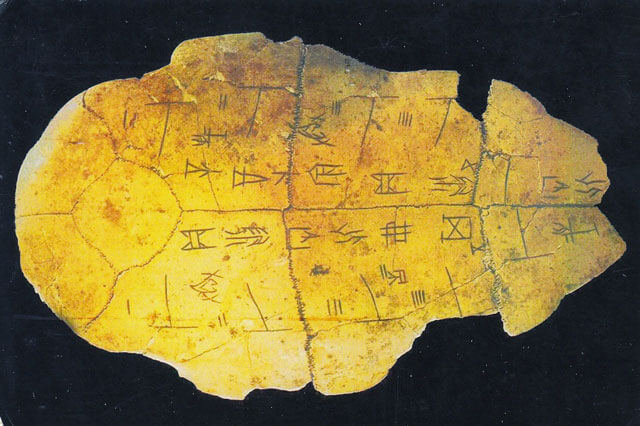
A common misconception about the origin of Chinese writing is that 甲骨文 (literally translates to Oracle bone script) was the earliest form of Chinese characters. These characters were carved onto animal bones or turtle shells, and mainly used for divination during the Shang dynasty.
However, given its level of sophistication, Professor Zheng Huisheng (郑慧生老师) from Henan University posited Chinese writing had its roots in an earlier form, 陶文 (script etched on ancient pottery). Regardless, Chinese script underwent thousands of years of evolution over the dynasties before maturing into the form we know and use today.
Besides the characters themselves, there’s also the issue of how these characters were laid out into texts. Traditionally, Chinese characters were written from top-to-bottom, right-to-left. Nowadays, it is quite common to see Chinese texts being laid out in a typical Western horizontal layout, and read from left-to-right instead.
The first known publication that utilised a horizontal layout was 《科学》, a science magazine which, in its inaugural issue on January 1915, attributed the choice of horizontal layout purely for the sake of convenience of printing formulae.
本雜誌印法,旁行上左,並用西文句讀點之,以便插寫算術及物理化學諸程式,非故好新奇,讀者諒之。
Although there wasn’t a conclusive explanation (that I could find) on why Chinese script traditionally used the vertical right-to-left layout, the matter of fact is nowadays, most Chinese books use the horizontal layout. This paradigm shift was largely attributed to the 新文化运动 (New Culture Movement) during the mid 1910s and 1920s, when several prominent scholars led a revolt against traditional Chinese culture and Confucianism.
Interesting fact, the founder of my alma mater, 陈嘉庚 (Tan Kah Kee), first proposed horizontal typesetting in June 1950 at the Second Session of the First Chinese People’s Political Consultative Conference (CPPCC) National Committee. Following that, on 1 Jan 1955, 《光明日报》published its first left-to-right edition stating that the move to a horizontal layout is simply a step forward in development.
中国文字的横排横写,是发展趋势。
The 19th and 20th centuries was a tumultuous time for China, and the aforementioned New Cultural Movement not only triggered a pivot in text layout, it also saw the introduction of simplified glyphs. 钱玄同 (Qian Xuantong), who was one of the key figures of the New Cultural Movement, played a pivotal role in this endeavour. As a result, we now have 2 “versions” of Chinese glyphs, simplified and traditional. The former used widely in China and Singapore, while the latter is commonly used in Taiwan, Hong Kong and somewhat in Malaysia.
Research-triggered brain dump (skip to next section)
As mentioned, I seem to be awfully fond of going down rabbit holes and often barely 20% of what I read and discover end up in the article. What started out as a brief foray into the history of Chinese writing ended up becoming a deep dive into how the world ended up the way it is. There are a lot of ideas that popped into my head during this process and I’m just going to dump them here. Feel free to skip forward (but 😘 if you read through).
Do you AU?
My understanding about the history of computing came from reading books and watching the odd documentary. Recently, Jen Simmons posted a tweet asking about graphic design resources from a non-American perspective. This got me thinking. I suppose the reason for vertical scrolling is because the Western world had a step up, a first-mover advantage, if you will, when it came to digital.
But why was that? Why didn’t the Industrial Revolution happen in China, given that it was comparably developed back during the 18th century. A couple papers I read proposed some theories I found pretty thought-provoking.
Before the Great Divergence: The modernity of China at the onset of the industrial revolution by Jan Luiten van Zanden proposed that China didn’t ‘miss’ the Industrial Revolution. Rather, it did not need it at the time. China was one of the most technologically advanced civilisations for a large swath of human history, and perhaps this may have been its disadvantage as well. Innovation is often borne from necessity, and I’d like to think that the Chinese invention of printing was a prime example of that kind of innovation.

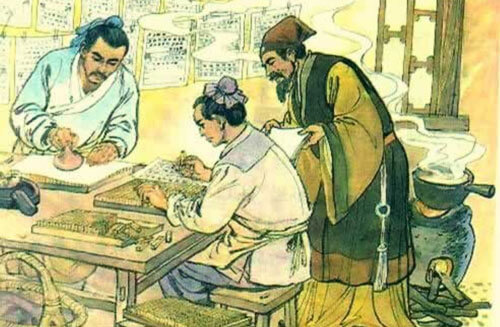
FYI, printing was invented by 毕昇 (Bi Sheng) during the Song dynasty. Not much is known about the details of his life, but it seemed he worked at a print shop. It was there he created the first movable type system using clay types.
Imagine an alternate universe where Eastern culture reigned supreme. How would we code if Chinese was the universally used language of choice. I find this almost as abstract as imagining higher dimensions. Because I’m already so anchored by code being written in alphabets, I wonder how code would have been written using a logographic writing system. Perhaps the keyboard wouldn’t be the primary input mechanism at all. How differently would the world have developed?
Punctuate what?
I also wandered down the rabbit hole of punctuation, largely because I often swap between Chinese and English when messaging my friends and punctuation using Chinese language input is mono-spaced. I use the ellipsis way too much than I should and end up switching inputs simply to type in 3 periods in my Chinese conversation. So I wondered if Chinese language originally had punctuation to begin with. As far as I knew, the ancient scrolls I saw in museum exhibits never had commas or periods.
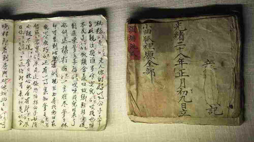
Traditionally, Chinese was written in its classical form, known as 文言文 (possibly translated as Literary Chinese, I think). Its beauty is in that a lot of meaning can be expressed in very few words. Punctuation was generally not required as the necessary pauses could be inferred from standardised sentence structures and phrases used, giving a natural cadence when read.

As the language evolved, the spoken version of Chinese started to diverge from this classical style and eventually became quite distinct. Even though some well-known novels like 红楼梦 (Dream of the Red Chamber) and 西游记 (Journey to the West) were written in vernacular Chinese, formal texts were written in classical Chinese. Hence, a majority of the population who weren’t educated in classical Chinese could not understand much of the printed texts.
Part of the New Cultural Movement also involved the spread of vernacular Chinese as the mainstream form of written Chinese, in a bid to increase literary rates among the people. As much of this linguistic development was modelled after Western doctrines, punctuation found its way into written Chinese texts.
Chinese fonts offline and online (skip to next section)
The details are fuzzy to me now, but I do recall hours spent troubleshooting why Chinese wouldn’t display correctly on the various computers I was tasked to fix years ago. Text would appear as 乱码 or 豆腐, each character displayed as a rectangular block instead of legible text. Chinese input was sketchy on Windows 95, so we used a software called Chinese Star instead.
Chinese language support nowadays is pretty good IMHO, and I can’t remember having to explicitly troubleshoot display issues in recent years. Although I read and write Chinese quite often on my PC, I don’t actually use any Chinese software applications, so if you have issues with those, check out Pinyin Joe’s Chinese Computing Help Desk.
A common term when discussing Chinese fonts is CJK, which simply stands for Chinese/Japanese/Korean fonts. Adobe developed the CID-keyed font file format for fonts with large character sets, and CJK fonts were derived from this technology. A typical professional Chinese font has around 20,000 glyphs, give or take a couple thousand, which explains why most Chinese font files measure in the megabyte range. This also makes using custom fonts online quite a challenge.
My go-to resource for all things Chinese fonts online is UI consultant, Kendra Schaefer. She wrote very comprehensive posts on using Chinese web fonts on her own blog and a complete primer to Chinese typography for Sitepoint. You should really read them. If you want to use Chinese web fonts for your project, she’s got you covered.
Laying out Chinese fonts (skip to next section)
But we want to talk about layout for Chinese fonts, using CSS. The CSS Writing Modes Level 3 module covers CSS support for various international writing modes, from left-to-right, right-to-left, bidirectional and vertical. The specification has some terminology that describes the flow of text for writing systems.
Basic terminology
The inline base direction refers to the direction that content is ordered on a line, and defines where the line starts and ends. This post’s inline base direction is left-to-right. The direction property, the unicode-bidi property (more on this later) and the inherent directionality of any text content will dictate the ordering of inline-level content within a line.
The block flow direction refers to the direction block-level boxes stack and the direction of this stacking within their container. The writing-mode property dictates the block flow direction. So for this post, the block flow direction is top-to-bottom.


The typographic mode is applicable to vertical scripts (think traditional Chinese or Japanese), and dictates if the text should have typographic conventions for vertical flow, which is different from a rotated horizontal script.
There are 2 writing modes, horizontal writing mode has horizontal lines of text which flows from top to bottom, vertical writing mode has vertical lines of text which can flow from left to right or right to left.
Certain scripts, like those written in Arabic or Hebrew, have a bidirectional property, whereby characters or words on the same line of text have mixed directionality. It’s quite common to have scripts interspersed with Latin characters, and this becomes rather tricky to render.
Browsers utilise the Unicode Bidirectional Algorithm or bidi algorithm to render text in the correct order. For Chinese, this is less applicable, so I won’t cover it in detail.
writing-mode property
This property dictates whether lines of text in a block are laid out horizontally or vertically, and the direction of these blocks. It is fully supported by all current browsers except Opera Mini.
Live example:
从1987到现在
Live example:
从1987到现在
Live example:
从1987到现在
*Experimental value, may or may not continue to be in the specification
Live example (only works in Firefox):
从1987到现在
*Experimental value, may or may not continue to be in the specification
Live example (only works in Firefox):
从1987到现在
text-orientation property
A writing system can have either horizontal-only native orientation, vertical-only native orientation or be bi-orientational. Chinese, or the Han writing system is bi-orientational, which means text can be laid out vertically or horizontally. The specification contains a list of scripts categorised by native orientation.
Browsers assign all glyphs a horizontal orientation by default, and for vertical layouts, the user agent needs to transform the text to a vertical orientation. This transformation is known as the bi-directional transform and there are 2 ways to do this, by rotation or by translation.
Most CJK characters translate, which means they always remain upright, and orientate correctly when laid out vertically. The text-orientation property specifies the orientation of text within a line, and only apply to vertical typographic modes. There is no effect applied when writing-mode is set to horizontal-tb.
Live example:
从1987到现在
Live example:
从1987到现在
Live example:
从1987到现在
text-combine-upright property
This property also only applies to vertical writing modes. It combines multiple character glyphs into the space of a single typographic character unit. The most common use case for this is rendering dates, especially those for the Japanese or Taiwanese calendar (because their years are less than 4 digits long).
Live example:
民國101年7月22日
Live example:
民國101年7月22日
*Not supported by any browser at time of writing
Live example:
民國101年7月22日
Let's build a demo! (skip to next section)
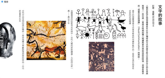
Typochina is a research group out of Comdesign Lab, a design research institution established by the School of Design of Hunan University. They’ve published a number of articles about the history, various resources and research on Han characters. If you can read Chinese, you definitely should check it out. I’ve used the article 文字的故事 for this typographical experiment.

Typographic styles for Chinese text
I came across this fantastic project called 汉字标准格式 which is a CSS typography framework optimised for Hanzi. For my demo, I didn’t need such an extensive framework but I did use it for reference when it came to writing my own styles.
My main source of reference was W3C’s Requirements for Chinese Text Layout. My typographic styles are very basic, covering fonts, line height, margins and spacing, without the use of any resets. I left most of the default browser styles in place.
I also changed the text from Simplified Chinese to Traditional Chinese, this is more of a personal style preference. For Traditional Chinese fonts, the punctuation is positioned in the middle of the bounding box, while Simplified Chinese fonts have the punctuation skewed to the left-bottom corner. I felt it looked better for the punctuation to be centred for the vertical layout. Besides, it’s more common to see Traditional Chinese laid out vertically than Simplified Chinese anyway.
I found out that if you don’t explicitly set a Traditional Chinese font, the punctuation will always be in the Simplified Chinese style (spent way too much time figuring this one out 😭). If you read the previous section on Chinese web fonts, you’ll know that custom fonts are huge. So system fonts are preferable. I chose to use 黑体 (Chinese version of sans-serif) as the body font. Font stack looks like this:
body {
  font-family: "Microsoft JhengHei", "微軟正黑體", "Heiti TC", "黑體-繁", sans-serif;
}
The line-height was set to 2, given that Chinese text is visually more dense, more breathing room is necessary. As per the layout requirements, text-align was set to justify. Chinese fonts do not have italics, so for my figcaptions, I chose a different font family instead. I set the line-height a little tighter for figcaptions, because there is less text there and also to differentiate them from the body copy a bit more.
figcaption {
  font-family: "MingLiU", "微軟新細明體", "Apple LiSung", serif;
  line-height: 1.5;
}
Cross-browser font support is a bit tricky when it comes to mobile devices, because it seems that there is no 宋体 (Chinese equivalent of serif) for iOS or Android. So that’s that. This warrants further confirmation with someone more experienced than me, so I might update this part in future.
The suggested line length for Latin-based scripts is around 45-75 characters per line, but for Chinese characters, that’s a little too long. I found that around 30-40 characters per line works out quite well. I took some reference from print, in commonly seen book heights and line lengths for popular paperback novels.
Mode switcher? Anyone?
I also thought it’d be interesting to add a mode switcher (seemed like a good idea at the time) so people can swap between horizontal and vertical layouts. This switcher would be on top of the page, the first element in the body. Naturally, when you toggle the layout, the switcher jumps to the right of the page instead. Fixing its position on the top left corner of the page was probably a better idea.
The switcher utilises the checkbox hack to trigger the switch in writing-mode. After a LOT of experimenting, I ran into a couple of issues. Firstly, when the writing-mode changes from horizontal to vertical, the scrolling still starts from left to right. This means users see the end of the article when I switch to vertical right-to-left mode and need to scroll all the way to the right to get to the start of the content.
Another issue was related to art-direction of the images on the page. I started off the design for a vertical layout, so my images were portrait-oriented (is that even a term?). But when the layout switches to horizontal mode, the images look out of place. I wish the picture element took writing-mode as a media query, but I suppose this use-case is quite niche. Who on earth would want to switch text orientation? 🙋
My end solution is more of a hack than a solution, but I categorised the images into 3 groups, rotatable, stackable and square. Let me explain. Rotatable means that the image works simply by rotating it 90 degrees. Stackable is actually 2 images that are stacked when vertical and side-by-side when horizontal, and square just means the image can be used for both vertical and horizontal layouts. As I said, this is a hack.
Flexbox was pretty useful for my art direction problem. So for the stacked category of images, and activating flex-wrap to wrap on the vertical layout did the trick. I personally think all this will make much more sense if you refer to the source code for the demo.
Wrapping up
What started out as an article to explore the CSS writing mode property grew into an exploration of Chinese history and the key circumstances that led to the China that we know of today. But it also made me realise that a lot of the articles and books I read are very skewed towards western and American perspectives (not that it’s a bad thing, just an observation).
I’m lucky enough to be fluent in Chinese, and hence there is a wealth of resources written from an Eastern perspective (okay, mainly Chinese) that are accessible to me. But this also made me realise that the onus is on me to seek out perspectives that are different from what I’m familiar with. There are so many different writing systems and scripts other than those I’m familiar with, and I’ll definitely be looking into those moving forward. Fun times ahead, people.
Further reading
For historical context
On specifications
- CSS Writing Modes Level 3
- writing-mode on MDN
- Unicode Bidirectional Algorithm
- Unicode Bidirectional Algorithm basics
- Improving text layout and typography on the Web and in eBooks
- Requirements for Chinese Text Layout