Okay, that wasn’t my best headline, writing is hard 🤷. But let’s face it, the web has an obesity problem. I remember the first time I did some research for a talk I gave at Talk.JS back in 2015, and found the httparchive, which had statistics on web page sizes since 2010. I said that exact phrase during the talk, and let’s just say I don’t think the web has started on its diet plan or gym membership yet.
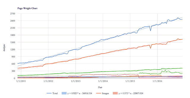
And because I’m a weirdo who likes charts, I wanted to see how this weight gain happened over the past 6 years. It probably crept up on us, I mean, you can’t just wake up 30 pounds heavier overnight. As of 2 Dec 2016, the average size of a web page is 2.46mb, and 1.623mb (or 65.9%) of that is made up of images. So I plotted the weights of different content types over time to how the trend looked. If images were donuts, the web was eating more and more of them over time.
Throwing numbers like I just don’t care
Research conducted by FT.com revealed that a slowdown of 3 seconds on page load time caused a mean percentage drop of 7.9% in article views over a period of 28 days. From an ecommerce perspective, Akamai conducted a survey back in 2009 which showed that consumers start to get impatient when pages take longer than 2 seconds to load. Mozilla managed to increase download conversions by 15.4% by shaving 2.2 seconds off their landing page load time back in 2010.
According to ICT Facts and Figures 2016 report published by the International Telegraph Union (ITU), mobile broadband subscriptions are growing at a much faster rate than fixed broadband subscriptions in developing countries.
But the matter of fact is only 15% of the world’s citizens have access to affordable high-speed internet. It is our responsibility as people who build for the web to optimise our sites and applications so we are not exacting additional economic burden to our users, especially those 85% for whom high-speed internet is a significant expense.
Besides, the average internet user is no longer someone who’s sitting at a desk, tapping away on a keyboard. People are using the internet from their smartphones and tablets, scrolling through their newsfeeds on the toilet, watching videos on the bus, sending chat messages while walking down the street.
And because they are mobile, a stable and fast internet connection is not guaranteed. Google’s analysis of mobile latency published in September 2016 showed that the average load time for mobile sites is 19 seconds over 3G connections. Usain Bolt can run 200m in that time 🏃🏿.
Anyway, the point is, big images + spotty connection = 💩 experience.
But we must have images…
Must you?
Really?
*my face here, with one raised brow (emoji coming in 2017) *
Okay, I shan’t be unreasonable here, but there is value in taking the time to consider alternatives to using an image where possible. Gradients, shadows and rounded corners can all be done using just CSS. We can even do all manners of decorative shapes using just HTML and CSS, check out A Single Div. Maybe the stuff on there is a little too elaborate, but it shows that we can do a lot with CSS nowadays.
Designing for the web requires that we understand the nature of the web, how browsers behave. Browsers render all the elements that make up a web page sequentially, after the HTML has been first parsed. The remaining assets that make up the web page, things like scripts, stylesheets and images, are retrieved in subsequent requests to the server.
These round trips between the browser and server take time, and are expensive in terms of performance. A large image simply takes more time to load. If your user is on a spotty internet connection, large images clogging up the already limited bandwidth is just going to slow your page load time to a crawl.
Web design is its own domain, with its closest counterpart being print design. But one is dynamic and fluid (the web, just in case you lost me), while the other is static. We sometimes fall into the trap of treating the web like a static medium, trying to herd pixels into exact positions. Let’s not do that. Let’s embrace the nature of the web. To quote Jen Simmons,
Translate. Don’t Transfer.
So yes, the inability to use unlimited hi-resolution images in your web design is a constraint, but that’s not a bad thing. Constraints fuel creativity.
Give your images a makeover
Let’s talk about the art direction of the images themselves first. There are certain tricks we can employ to reduce image file sizes. Most images and photographs have a point of focus, where we want users’ eyes to be drawn to. For such images, keep that area sharp while blurring everything else. This works for a variety of styles of images, from headshots to product images.


You can apply a Gaussian blur to the non-critical areas of the image. Blurring the background can also simulate a shallow depth of field. If you’re using Photoshop, then using Lab Colour mode allows you to apply a stronger blur without compromising foreground quality. Convert the image to Lab Colour and apply the blur to the a and b channels, while maintaining definition in the Lightness channel.
Grey-scale images have smaller file sizes than colour images, hence if art direction permits, using grey-scale images saves quite a bit. Monochromatic designs have 1 single base colour, with splashes of a complimentary accent colour. Such designs avoid the problem of colour clashes, and with less distraction, can provide more focus on the content. Of course, this isn’t suitable for every website, but can be a design choice to consider, if appropriate.


Ideally, you’d want to export your images using your image editor’s “save for Web” (or similar) functionality, as demonstrated earlier, and then run them through a specialized image optimiser. Plenty of such options exist, either online or as installed applications, like FileOptimizer for Windows or ImageOptim for Mac and Linux.
I want to once again emphasise that I’m not asking designers to eschew images altogether. Graphics are a very important aspect of visual communication. Rather, we can start considering incorporating images in a way that does not compromise performance. This would require some general knowledge about how digital images work.
Let’s learn more about digital images
Digital images are fascinating, if you think about it. How is it possible that we can capture a snapshot of something in real life and recreate it on a screen? Or create any visuals at all using a computer? It’s all data expressed as light and electrical signals.
Ah, technology.
Stanford’s CS101 covers the basics of digital images rather well, among lots of other computing-related fundamentals.
Image data can be stored in a variety of formats, they can be compressed, uncompressed or vector. The 2 major families of graphic formats are raster, which uses lots of individual coloured pixels to form complete images, and vector, which uses mathematical formulae to create polygons as images on the screen. Even though there are hundreds of proprietary image formats out there, we’ve settled on a handful of general purpose formats.
I personally learnt a lot about images from Colt McAnlis’s articles and episode #36 of the Toolsday podcast. You should check them out.
JPEG (Joint Photographic Expert Group)
JPEG is a lossy file format that was developed for compressing photographic images by removing information from the file that is less discernible to the human eye. JPEGs are ideal for photographic images that don’t require transparency rather than line drawings or images that require precision and sharpness.
With JPEG, you shouldn’t save the same image file again and again because doing so degrades the quality of the image substantially. Instead, it’s better to export the original working file as a JPEG image only as a last step before publishing. When saving JPEGs with your image editor, there is the option of adjusting the quality of the resultant image.


The original image on the left clocked in at 79kb, but after using the Save for Web option in Adobe Photoshop at 60 percent quality, the file size was halved, but the difference is barely discernible (I’m sorry you had to download an unoptimised image for this).
There are more objective methods than “eye-balling it” to determine the appropriate quality level, however. For example, you can use open source tool Butteraugli as a quality metric for lossy image compression.
In general, the human eye cannot really discern the difference between 75% and 100% quality, but the file size savings are significant. JPEG images are divided into 8x8 pixel blocks upon saving, and if the quality is set too low, this blockiness becomes apparent. Each of these 8x8 blocks are optimised independently. Aligning the edges of your image to an 8-pixel grid helps the optimiser keep the image sharp. Especially effective if your image is rectangular.
PNG (Portable Network Graphics)
Portable Network Graphics (PNG) is a lossless file format good if you need a fine level of detail in your images. PNGs also handle transparency much better than Graphic Interchange Format (GIF) files.
PNG8 is the indexed colour-depth version, which produces smaller file sizes but can only store 256 colours. PNG24 has a direct colour depth and can store the entire gamut of colours, but the files will end up significantly larger than JPEGs or GIFs. Picking the appropriate format for your image can save you quite a bit, i.e. it’s safe to use the PNG8 format if your image doesn’t have a lot of colours.
Reducing the number of unique colours in your PNG can improve scanline filtering and achieve better image compression. One way to do this is with the Posterize function in Photoshop, which can be found in the Layers palette. Pick the smallest amount of levels you can get away with.
The main reason for using PNGs is transparency. Often, designers will crop the outline of a particular object/person from a source image for use on another background. The downside is that such image files would be considerably larger than if they were saved in another format, like JPG.
SVG (Scalable Vector Graphics)
For icons and simple shapes, Scalable Vector Graphics (SVG) is your best bet. SVGs are an XML-based vector image format, which scale perfectly without increasing file size. An optimized SVG is often a fraction of the size of its rasterised counterpart.
SVGO is an excellent Node.js–based tool that can help strip redundant information from SVGs without affecting rendering. You can install and use it directly from the command line or as part of a project build step. There is also an online web app, SVGOMG which serves as a GUI version of the tool.
Being XML-based, SVGs also benefit from gzip compression on the server-side to reduce file transfer size. Make sure to configure your server to enable gzip compression.
GIF (Graphic Interchange Format)
GIF is also a lossless file format and has been around for a long time, so it has excellent support. When PNGs were first introduced, GIFs were considered a safer choice, but today, the only viable use case for GIFs is animation. If you can get away with it, muted videos can actually be smaller in size with better quality.
If you have to use an animated GIF, there are a couple of things you can do to reduce file sizes. The simplest thing to do is literally make the image smaller in size. There’s a reason why many GIFs you see online are around 400px wide, and still come in at around 1 to 2mb.
Reducing the number of frames is also a good option. You can delete every second or third frame from the Timeline Panel, then increase the duration of the remaining frames to compensate for the removed frames, otherwise your animation will run faster.
Reducing the number of colours to 64 or less can save you space as well, although you will have to use some discretion to whether you can accept the decrease in quality. Most GIFs you see online tend to be low quality for this reason. Dithering can help with the quality, but keep in mind that more dithering increases the image size. The Diffusion algorithm in Photoshop lets you adjust the amount of dithering on your image.
Some other options available in Photoshop include Web Snap, which snaps some of the colours in your GIF to web-safe colours, sort of an anti-dithering actually. Lossy compression will remove some visual information to save on file size, and deselecting Transparency will fill semi-transparent and transparent pixels with a matte colour instead. Checking the Interlaced option loads the image in several passes, like progressive JPGs.
New image file formats
There are also a number of new formats being developed that offer higher quality at lower file sizes. As of now, these formats are far from being universally supported. Still, it’s good to know about their existence and follow their development as we go along.
WebP
WebP is an image format for the web developed by Google that provides both lossless and lossy compression. Both compression formats support transparency and generally result in file sizes that are 3/4 the size of a comparable PNG image. It is natively supported in Chrome and Opera.
FLIF (Free Lossless Image Format)
FLIF is a very recent lossless image format that supports progressive decoding. Based on benchmarking done by Cloudinary, it seems to outperform all other image formats available at the moment. Currently, FLIF is not natively supported in any browser. To use it now, you will need to utilise the Poly-FLIF polyfill.
BPG (Better Portable Graphics)
BPG is a new image format meant to replace the JPEG image format. It has a high compression ratio and unlike JPEG, supports transparency. To use BPG, you will need to integrate a JavaScript BPG decoder (56kb gzipped) in your site for browsers to recognise the image.
JPEG-XR (JPEG extended range)
JPEG-XR was originally developed by Microsoft as HD Photo, and supports both lossless and lossy compression. It also supports transparency, and has higher compression ratios than JPEG at similar image qualities. JPEG-XR has multiple possible file extensions: .jxr, .hdp and .wdp. Unfortunately, only Internet Explorer and Edge supports this format.
Responsive images on the web
The concept of responsive design revolves around having a single website that adapts to the screen-size its being displayed on. The problem with such an approach is that the same content is being served regardless of device, same text, same stylesheets, same scripts, and most critcally, same images.
Remember that images make up 64% of page weight? If only there was a way to serve lower resolution (thus smaller) images on devices with small screens to save space. Here’s where the picture element and the srcset attribute come into play.
The picture element and srcset and sizes attributes have been drafted into the HTML 5.1 specification; as of October 2016, all major browsers (except Internet Explorer and Opera Mini) fully support both picture and srcset. The specification was developed from practical use cases for responsive images and tackles the following issues:
- Device pixel ratio–based selection
- Viewport-based selection
- Art direction–based selection
- Image format–based selection
Just to clarify, picture is an HTML element, while srcset and sizes are attributes for the img element. Depending on your use case, you may not need the picture element to use responsive images.
Before this specification existed, browsers had no way to know the image size relative to the viewport or the source file’s dimensions, making it impossible for the browser to intelligently serve the appropriately sized image. With srcset, you can declare a set of image sources complete with pixel density or width information to the browser using x and w descriptors, respectively. The sizes attribute lets you tell the browser what size the image will be at a particular viewport width.
The picture element is a wrapper for the img element and its src attribute. The source element, in this case, will be familiar to you if you’ve used the video or audio elements before. You can use multiple source elements to specify multiple media resources for use.
If you want to serve the exact same image but in different sizes or pixel densities, then you should use an img element with the srcset attribute defined. If you want to serve a specific image at a specific breakpoint or serve images in one of the newer formats, then you should use the picture element, instead.
Note that for all the use cases, whether you’re using picture or srcset and sizes, the image src attribute MUST be present. Apply alternative text to the img element, not the picture tag. If an older browser encounters such code, it will just read off the image’s src attribute like any other image, so your image won’t be broken.
Code Examples
The markup for using picture and srcset probably takes some time to wrap your head around, so here are some examples.
Device pixel ratio–based selection:
<img srcset="mark-383.jpg 1.5x, mark-510.jpg 2x" src="mark-255.jpg" alt="Outsider's mark" />Viewport-based selection:
<img
  srcset="kaldwin-480.jpg 480w, kaldwin-640.jpg 640w, kaldwin-960.jpg 960w, kaldwin-1280.jpg 1280w"
  sizes="(max-width: 400px) 100vw,
             (max-width: 960px) 75vw,
             640px"
  src="kaldwin-640.jpg"
  alt="Emily Kaldwin"
/>
Art direction–based selection:
<picture>
  <source media="(min-width: 960px)" srcset="karnaca-large.jpg" />
  <source media="(min-width: 575px)" srcset="karnaca-medium.jpg" />
  <img src="karnaca-small.jpg" alt="City of Karnaca" />
</picture>
Image format–based selection:
<picture>
  <source type="image/vnd.ms-photo" src="far-reach.jxr" />
  <source type="image/jp2" src="far-reach.jp2" />
  <source type="image/webp" src="far-reach.webp" />
  <img src="far-reach.png" alt="Emily's power: Far reach" />
</picture>
There are many comprehensive articles on responsive images that delve into details from origin, to implementation, to the future. Jason Grigsby’s Responsive Images 101 series is an excellent place to start. Eric Portis has also written many articles on the topic. Just google “Eric Portis responsive images”.
Wrapping up
Okay, that went on for longer than I expected. But that’s because images is such a heavy topic (pun completely intended). On a more serious note, it really is vital that designers and developers are cognizant about page weight issues. Creating sites that are light-weight and load properly even with a slow connection is part of building a better web, and is something I aspire to do. Join me in this effort?