I’ve had quite a start to 2018, largely due to my tendency to “say yes, worry later”, which has both served me well yet sometimes makes me question my intelligence. So in January 2018, I became gainfully employed full-time, organised a half-day CSS conference, spoke at JSConf.Asia and conducted a workshop on CSS grid there as well.
Can you understand why I tell my friends I’m an idiot who is incapable of checking her calendar now? Anyhow, over Christmas, I got to know a bunch of friends who just graduated from one of the many bootcamp programs here in Singapore.
This particular bootcamp apparently did not place much emphasis on front-end technologies as they did not cover Javascript and mainly used Bootstrap as their CSS solution for all their projects.
If you don’t know me, just know that I really, really dislike pre-canned CSS frameworks. I do agree every project ought to have their own customised CSS framework, but we’ll talk about that another day.
The TLDR version of things is that, since I was holding a CSS grid workshop for JSConf.Asia, why not get two of them to be my co-facilitators, and I’d just give them a crash course on CSS layout beforehand? Just another one of my hare-brained schemes 🤷.
Conclusion: CSS grid is intuitive to new-comers, and will change the way we teach web layouts moving forward.
Establish understanding with questions
It might be just me, but I like asking basic questions first. Like:
- What is Bootstrap?
- What is CSS?
- What do you think X is?
- Why do you think Y does that?
Something along those lines. Or if I’m feeling cheeky, I start off with “tell me about CSS”, to which I usually get this look 🤨. But it does help to understand where the other party stands so I can better get my points across.
Befriending the browser is key
I may not be the most experienced web veteran around, but I have had my fair share of trying to explain to non-developers why certain designs were not feasible during my agency life. Eventually I realised that a lot of the issues arose from the lack of understanding of how a browser rendered stuff.
Almost every other medium I can think of allows for direct manipulation of the canvas. When you draw or paint, you can determine exactly where you want an element to appear, same goes for if you use any digital image creation software like Sketch or Photoshop. If you are used to such a mode of operation, the browser may seem unwieldy for design.
That’s because there is one more layer separating you, the creative designer, and the browser, which is the canvas. And that layer is code, the instructions we have to give the browser to tell it how we want our elements to appear. Without a solid understanding of the capabilities and behaviours of the browser, this will become as fun as trying to tell a toddler how to operate a forklift.
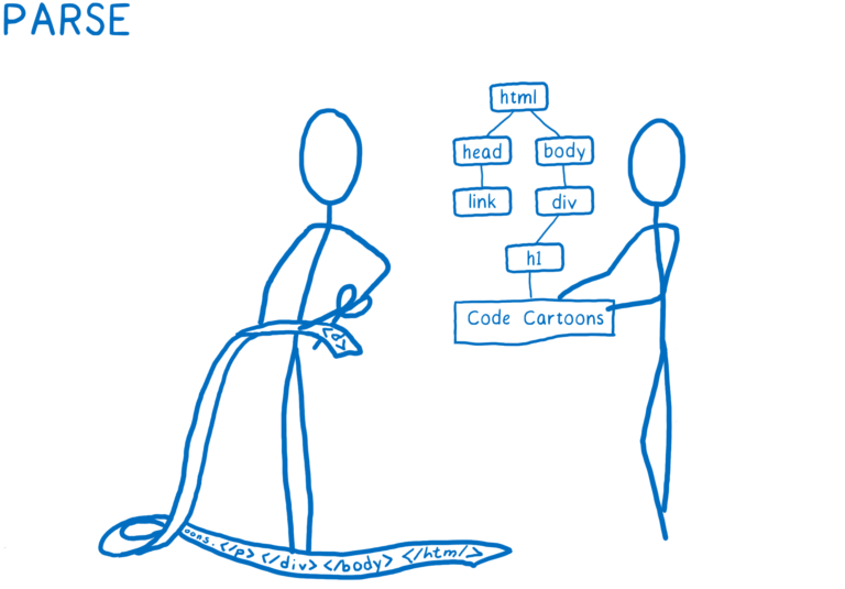
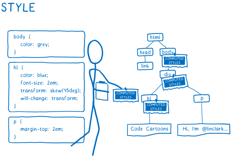
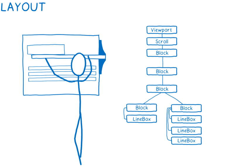
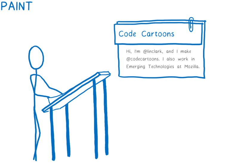
What I found really useful as a resource for explaining the browser was Lin Clark‘s article where she explained the Quantum CSS engine published on Mozilla Hacks last year. The steps of Parse → Style → Layout → Paint → Composite are so much more easily understood when she explains them.

Analogies are a thing
Another thing I found myself doing was using all sorts of analogies that were not web-related to get my point across. Sometimes, teaching feels like refining a stand-up routine (omg, I did it again), because as I rack my brain to explain things as simply as I can, new ideas pop into my head.
So these are the CSS-related analogies I used thus far:
- Chessboard and chess pieces, for grid item placement. Like, placing items on the grid is like placing pieces on a chess board.
- Jay-Z and Beyoncé, for the relationship between Grid and Flexbox. Like, how Jay-Z and Beyoncé are both great on their own, but together, achieve another level of awesomeness. Just like Grid and Flexbox. This is my go-to for every layout talk I’ve ever given 🤣.
- Water, for explaining the cascading, global nature of CSS versus the modular, encapsulated nature of most traditional programming languages. Like, traditional programming paradigms treat functions discretely, like stones you can pick up, but CSS is like water, which flows and cannot be controlled, only shaped.
- Team sport, for describing how the full power of CSS shines through when used in combination. Like, most tutorials or articles tend to look at a particular property in isolation, which is great for understanding and learning something new. But combining properties is what makes magic.
- Curated landscaping, for comparing past layout techniques with CSS grid. Like, pre-Grid layouts which relied on sizing the item was akin to tossing your seeds in general directions and just hoping they will all grow out in the right place. But grid lets us plant our flowers in specific plots so they all grow out exactly where we want them to.
This list will only continue to grow as I keep trying to explain web layouts to people, so stay tuned for more of the same. If you don’t subscribe to my brand of self-entertainment, well, not much I can do about that, can I?
A bit of history helps with understanding
Note that I said a bit, not a lot. That just becomes boring. I figured some background about this thing known as CSS would help resolve some untold emotional trauma amongst people who are uncomfortable with CSS. Or maybe not. I still have to try, right?
CSS has evolved along with browser capabilities over the past two decades, and the structure of its specifications have been updated along the way as well. CSS specifications are now modular in nature, to help with maintenance and updating.
If you stop to think about it, it’s been quite a journey, from having no way to do layout, to doing it in HTML with the table element, to hacking floats and flexbox, before we finally got CSS grid as a means to properly lay out a full page of elements.
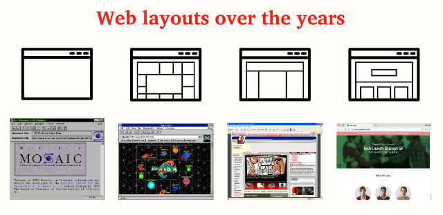
Explaining the context of why we had to jump through so many hoops to try to layout a page on the web makes it slightly easier to accept the nature of CSS (at least based on my limited sample size). Regardless, my inordinate love of CSS just meant that I was having the time of my life talking about CSS. My two friends who were on the receiving end…? You’ll have to ask them 🤣.
Team Anyhowly
anyhow /ˈɛnɪhaʊ/: in a careless or haphazard way.
-ly: is usually a contraction of -like, commonly added to an adjective to form an adverb, but in some cases it is used to form an adjective.
People who learned the English language properly will realise that Anyhow is an adverb already, hence the -ly is redundant. But Singlish being what it is, we don’t care. It’s like saying ATM machine, or LCD display. Redundancy is all around us, just accept it 🤷.
Because of my haphazard ways, I have decided to co-opt the term Anyhowly for my personal use. Like how we anyhowly organised Talk.CSS max-content edition (videos are all up ICYMI #shamelessplug), and how I anyhowly decided to ask two people with no prior experience with CSS grid to be my co-facilitators. Anyhowly™.

I want to take this opportunity to show my greatest appreciation to the two of them, Gloria Soh (left) and Shirlaine Phang (right), for going along with my monkeying about, and tolerating my lack of adulting skills. The JSConf.Asia grid workshop was more fun with them around anyway.
Team Anyhowly forever 🙆. May the monkeying never stop.