I have an Argentinian friend. Not an acquaintance. A proper good friend. This is highly improbable, at least in my mind. Argentina is about 15,690km away from Singapore. In a different continent, across a large ocean, with a different culture. But by a random twist of fate, and an honest mistake, I gained a friend from halfway around the world, who is also a developer.
So my friend runs Epyphite, a technology company focused on Data Science and Machine Learning. He’s a great software engineer, plus a really good guy, and he doesn’t like front-end web development very much. Which works out just fine because I love front-end web development. Long story short, he slapped together a website for Epyphite, because it’s necessary to have a web presence, then got on with aspects of his work that he found more palatable.
One fine day, I found myself with a spare afternoon, and decided to do something about the Epyphite website, which he was more than happy to let me run riot on. He just mentioned that the guys liked the existing colour scheme. Great, with that in mind, let’s see what could be done in one afternoon. Spoiler alert: 👇
Phase 1: Evaluating the present
This wasn’t a complicated site. It was a brochure site to provide information about the company, what they did and their contact details. The site used Node.js on the backend and EJS as the templating language. My plan was to go in and get out with minimal disruption to the server and back-end setup. So there was no rewrite of any back-end architecture, no touching of the server.js file, none of that.
The way the site was setup, it was pretty easy to see where the relevant files and folders were. For the HTML, the EJS files were in the Views folder and for the theme, the CSS, fonts, images etc. were in the Static folder. After clicking through every link on the site, I ascertained that there were only 2 pages, the home page and the about page. No JavaScript was necessary for this particular site either.
I wasn’t joking when I said the site was slapped together. There were a lot of files and libraries that were not relevant in the slightest. The site itself didn’t look that bad, but it definitely could be better.

Conclusion: wipe everything from those 2 folders and rewrite from scratch.
Phase 2: Spring-cleaning
As I was planning to rewrite everything from scratch, this wasn’t as complicated as it could have been. If you’re not familiar with EJS, it’s pretty much HTML but with the ability to use includes for shared components across pages. After purging all the irrelevant files, I was left with 3 includes, head.ejs, header.ejs, footer.ejs and 2 pages, index.ejs and about.ejs.
The first thing was to sort out the meta data of the site in the <head> element. With reference to Josh Buchea’s recommended minimum of what should go into the HEAD element, these are what I put in there. I added the description and author meta tags as well.
<meta charset="utf-8" />
<meta name="viewport" content="width=device-width, initial-scale=1.0" />
<meta
name="description"
content="Epyphite creates solutions that leverage the latest techniques in Artificial Intelligence to help businesses solve complex problems."
/>
<meta name="author" content="Epyphite" />
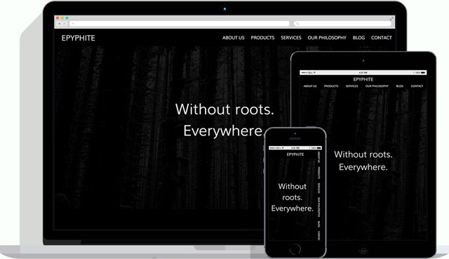
<title>Epyphite - Without roots. Everywhere.</title>I am also a stickler for sites having a favicon. I mean, I know it’s not mandatory, but I just very much prefer a site has one. Given that redesigning the logo is totally out of scope for this endeavour, I copped out by using the letter E enclosed in a circle. 🤷
So the next bit of stuff is relevant to favicons. I like using RealFaviconGenerator for my favicon generation needs.
<link rel="apple-touch-icon" sizes="180x180" href="/favicons/apple-touch-icon.png" />
<link rel="icon" type="image/png" href="/favicons/favicon-32x32.png" sizes="32x32" />
<link rel="icon" type="image/png" href="/favicons/favicon-16x16.png" sizes="16x16" />
<link rel="manifest" href="/favicons/manifest.json" />
<link rel="mask-icon" href="/favicons/safari-pinned-tab.svg" color="#28c3ab" />
<link rel="shortcut icon" href="/favicons/favicon.ico" />
<meta name="msapplication-config" content="/favicons/browserconfig.xml" />
<meta name="theme-color" content="#ffffff" />
And finally, the single CSS file that would contain all the necessary styles for styling this site.
<link href="/css/styles.min.css" rel="stylesheet" />Everything in the Static folder was purged so we could move on with a nice clean slate.
Phase 3: Just a bit of art direction
The point wasn’t so much a redesign of the site but more of a refactor and cleanup. So I wasn’t planning on going full scale change-all-the-things mode. We were definitely going to stick to the original colour palette which was white on black and #28c3ab (or light sea green, if you like colour names) for the accents.
According to Wikipedia, an epiphyte is a plant that grows harmlessly upon another plant (such as a tree) and derives its moisture and nutrients from the air, rain, and sometimes from debris accumulating around it. With that idea, I tried to find imagery that could show that sort of botanical characteristics but in the end settled on this image from StockSnap.io, and just made it really subtle.


Another site I like for getting asset files is Subtle Patterns, which appears to have been acquired by Toptal? Hmmm…keep getting ‘em cheques I suppose. Anyhoo, I picked up 2 subtle patterns to give the sections some differentiation (though 1 of them is barely noticeable).
I also took the opportunity to proof-read and rewrite some of the copy of site’s content. English wasn’t their first language, so some of the messaging wasn’t entirely clear.
As for fonts, given they’re a technology firm and the boys generally wanted a clean, minimalist aesthetic, I picked a sans-serif for the headings. But what type of sans-serif? Muli is a geometric sans-serif that is quite minimal, and fits in with the modern, technical nature of the business. Because it would be used for large sized headings, I went with the light weight.
Muli was paired with the serif font, Lora. Lora was designed by Olga Karpushina and published with Cyreal Fonts. It has some calligraphic qualities to it, and if you examine the serifs a bit closer, you’ll see it has a bit of quirkiness to it. One of value propositions for Epyphite is Customer Care and using a friendlier font for the body text seemed apt.
The original layout was, how shall we put this, rather repetitive. Each piece of content had a heading that was light sea green and a border around it, not unlike a button, followed by white text. There was also some inconsistencies in typographic hierarchy which could be cleaned up.

The markup for the site was rewritten to minimise nesting and have a proper structural hierarchy. You can see the outline from the Nu HTML Checker, which I find kinda nifty. Following that, the entire layout and design would be fully handled by CSS.
Phase 4: CSS party-time 🎉
I don’t know about you, but for me, writing CSS is a hoot. I have a standard starter SCSS kit that has been modified a couple of times over the years, and I may tweak the file structure again moving forward, but for this site, I just wrote everything in vanilla CSS.
The concept of flexible typography has always made a lot of sense to me. The browser is a canvas that is dynamic, we can change it’s dimensions as we please. So ideally, the content within that canvas should somehow be able to adapt to whatever screen size it’s being displayed on.
A common approach using media queries to change the font size as you hit certain viewport sizes. But there’s also the idea of fluid typography, where the size of the font resizes smoothly to match device width. Which really became a thing when viewport units got widespread support.
There have been a number of articles that show how fluid typography can be achieved with CSS.
- Molten leading (or, fluid line-height) by Tim Brown
- Viewport sized typography with minimum and maximum sizes by Eduardo Boucas
- Precise control over responsive typography by Mike Riethmuller
- Flexible typography with CSS locks by Tim Brown
I made use of Mike’s approach of CSS locks so this is the responsive font sizing setup:
:root {
  font-size: 18px;
}

@media (min-width: 320px) and (max-width: 960px) {
  :root {
    font-size: calc(18px + (22 - 18) * ((100vw - 320px) / (960 - 320)));
  }
}

@media (min-width: 960px) {
  :root {
    font-size: 22px;
  }
}
Since we have flexbox in our toolbox, I wanted to do a layout that was quite the fan-favourite amongst designers I worked with in Agencyland, and that was the alternating 2 column text-on-left, text-on-right pattern.

It used to be a pain to this using a plethora of floats. Changing the markup structure wasn’t a great idea either, the sections wouldn’t stack nicely on a narrow screen. But now, we have flexbox, and life is different. With the order property, I could do get that pattern on a wide screen without messing up the source order.


Another thing was the navigation links. The original navigation collapsed into a hamburger icon, which was thrown out with the rest of the files when I wiped the project clean 😏.
I was a bit tired of the collapsing navigation design pattern and we now have data that shows that this isn’t a great idea to begin with. Given there were only 6 items in the navigation menu, I chose to have the links displayed vertically along the right side of the screen instead, using one of my favourite CSS properties, writing-mode.
Wrapping up
This was a best effort given the limited amount of time I had to work on it, and my friend was pretty pleased with the end result. So it was a pretty good use of an afternoon, if you ask me 🍷.