
Making CSS from Good to Great
The Power of Subgrid


🥑 Developer Advocate 🥑

Web layouts over the years


Block layout
블록 레이아웃
designed for laying out documents
Inline layout
인라인 레이아웃
designed for laying out text
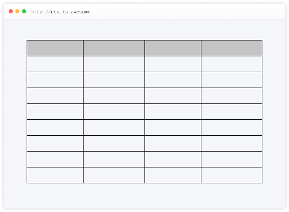
Table layout
테이블 레이아웃
designed for laying out 2D data in a tabular format
Positioned layout
절대 위치잡기
designed for very explicit positioning without much regard for other elements in the document
Flexible box layout
describes a CSS box model optimised for user interface design and designed for laying out more complex applications and webpages
사용자 인터페이스 디자인에 최적화되고보다 복잡한 응용 프로그램 및 웹 페이지를 레이아웃하기 위해 설계된 CSS 상자 모델을 설명합니다
Grid layout
Defines a two-dimensional grid-based layout system, optimised for user interface design.
사용자 인터페이스 디자인에 최적화 된 2 차원 그리드 기반 레이아웃 시스템을 정의합니다
Why is CSS grid special?
“Grid works from the container in,
other layout methods start with the item”
—Rachel Andrew
Layout technique: inline-block
Item A
Item B
Item C
Item D
Item E
Item F
Layout technique: float
Item A
Item B
Item C
Item D
Item E
Item F
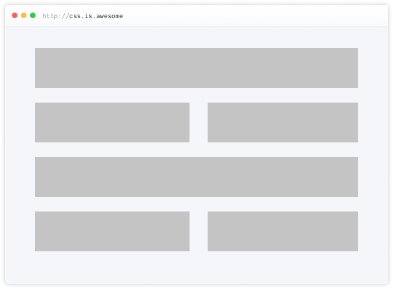
Layout technique: flex
Item A
Item B
Item C
Item D
Item E
Item F
Grid is the only layout technique that establishes a relationship between rows and columns of grid items.
그리드는 그리드 항목의 행과 열 사이의 관계를 설정하는 유일한 레이아웃 기술입니다
Basics of CSS Grid
Define your grid.
그리드를 만들

Place items in the grid.
그리드에 항목을 배치

Grid terminology


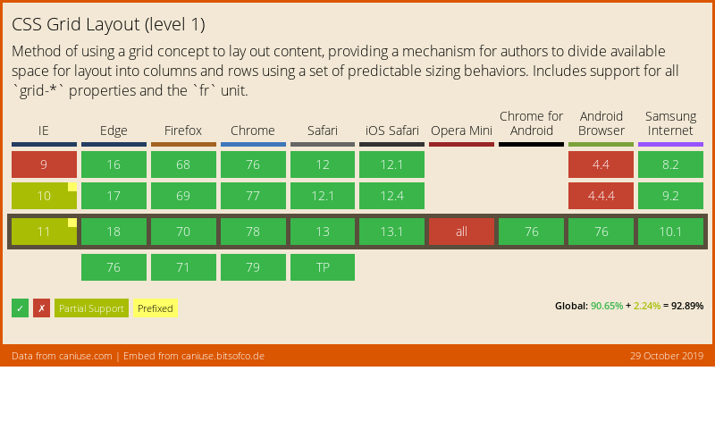
Browser support for Grid (Level 1)
Using DevTools to learn Grid
Live demo
What's in Grid Level 2?
-
Level 2 expands Grid by:
- adding “subgrid” capabilities for nested grids to participate in the sizing of their parent grids
- aspect-ratio–controlled gutters
Why do we need subgrid?
The subgrid syntax
Same properties, more values
grid-template-columns: subgrid <line-name-list>?
grid-template-rows: subgrid <line-name-list>?
The subgrid keyword indicates to the browser the nested grid will use the same sizing as its parent along the relevant axis.
.subgrid-container {
  grid-columns: 2 / 5; /* placement for the subgrid container itself */

  display: grid; /* you must still apply a display: grid to the subgrid */
  grid-template-columns: subgrid;
  grid-template-rows: subgrid;
}Using DevTools to learn Subgrid
Live demo
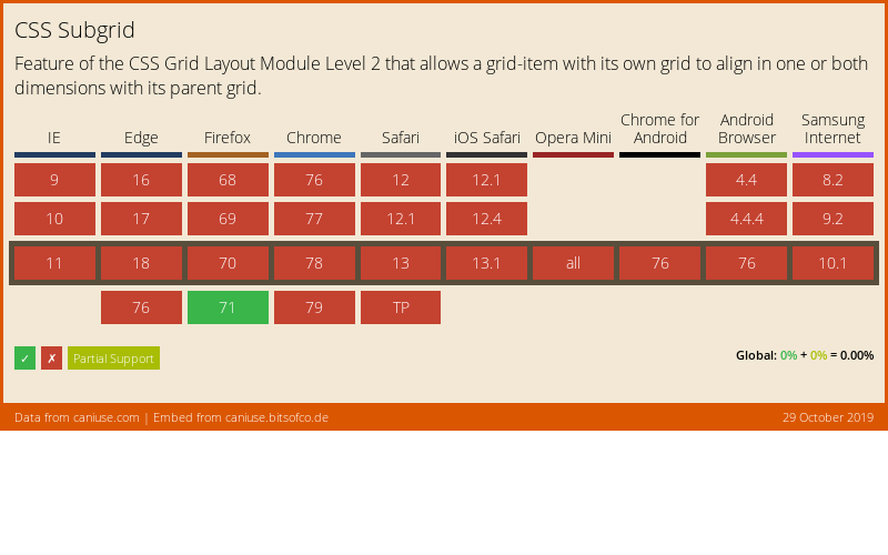
Browser support for subgrid
References
- CSS Flexible Box Layout Module Level 1
- CSS Grid Layout Module Level 1
- CSS Grid Layout Module Level 2
- Codrops reference: Subgrid
- Subgrid on MDN
- Grid Level 2 and Subgrid
- Why display: contents is not CSS Grid Layout subgrid
- CSS Grid Level 2: Here Comes Subgrid
- Grid by Example
- Researching a Property in the CSS Specifications
감사합니다 🙇♀️


Header font is Ostrich Sans by Tyler Finck.
Body font is Libre Baskerville by Pablo Impallari.